In today’s competitive real estate market, static photos are no longer enough. Buyers expect dynamic, engaging content that brings properties to life. Enter Reptov, a powerful new platform that transforms ordinary listing photos into professional marke ...


As an Amazon Associate we earn from qualifying purchases.
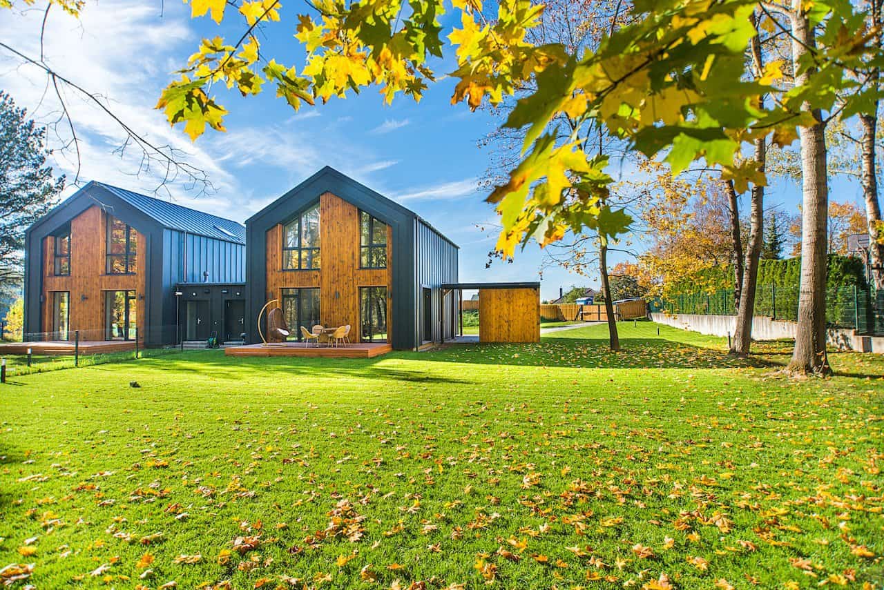
I often get asked about the difference between vibrance and saturation when editing images, especially in real estate
Quick Navigation
The primary distinction between vibrance and saturation is how they affect an image's colours. Saturation increases the intensity of colors across the image. Meanwhile, vibrance selectively boosts dull or muted tones without overly affecting others.
This subtle difference can make a significant impact. Particularly in real estate


Vibrance specifically targets and enhances the colors in dull or muted areas of an image without affecting already-saturated colors. This makes it perfect for adding some life to images without overdoing the intensity of colors.
Vibrance is particularly useful when I'm editing headshots, as it enhances skin tones without impacting the overall color balance of the scene. There are situations in real estate
On the other hand, saturation increases the intensity of every color across an image. For example, increasing the saturation slightly can enhance the colors of a sunset or vibrant foliage. This makes the image more eye-catching and appealing to potential buyers.
Whenever I post-process images in Lightroom, I find this control to be quite powerful, yet I use it cautiously. Otherwise, my pictures will look unnatural and unappealing when overused. This can be counterproductive when showcasing a property in the best light possible.
Vibrance and saturation play essential roles in enhancing the colors of your images. They share the common objective of increasing the intensity of colors in your photographs. This gives them a more visually appealing and dynamic look.
A study shows that a color's purity affects how a person perceives an object's size. This is also why the colors of your image can influence how big or small a space can look.
You can adjust or control saturation and vibrance using popular photo editing tools, such as Adobe Lightroom and Photoshop. These programs let you make targeted adjustments.
I've often found that many people need clarification on saturation and vibrance, especially in the context of real estate
Vibrance tends to bring out only dull or muted tones, making them pop without impacting vibrant colors. It is particularly useful for maintaining a natural look in skin tones, which is desirable in real estate
On the other hand, saturation increases the intensity of colors across the image, making every hue look more vivid. However, this can sometimes result in an artificial-looking scene, which might not be suitable for interior or exterior


In certain situations, you may use vibrance to enhance muted colors without altering the overall color balance. In other cases, increasing saturation can create a more striking and impactful image. Comparing them will help you better understand when to use them.
| Color concept | What Does It Do | When to Use |
| Vibrance | Intensifies muted colors selectively | Enhance colors, bring out details, retain skin color |
| Saturation | Boosts color intensity | Create vivid colors, make eye-catching color effects |
When it comes to photo editing, understanding the difference between vibrance and saturation is crucial. Saturation increases the intensity of colors, while vibrance boosts only muted and cooler colors, not skin tones.
Let's dive into how you can apply these adjustments and make your real estate photos look professional.
I often include people in my pictures to give a sense of scale or to make the space more inviting. In these situations, skin tones must appear natural and balanced.
Saturation might not be the best choice here, as it intensifies colors, whereas vibrance selectively targets muted colors, preserving skin tones. Using vibrance, I maintain natural-looking skin tones while enhancing the colors in the rest of the photo.
Real estate
As vibrance increases muted colour saturation, I create a balanced and visually appealing result. In contrast, saturation might lead to unrealistic colors that could distract from the property's features.
For such reasons, applying vibrance responsively can enhance real estate pictures, achieving a professional and appealing look.
A study shows that 90% of snap judgements about buying decisions are based on colors alone. You wouldn't want to drive away potential buyers because of incorrectly applied saturation or vibrance.
When working on real estate photographs, I often apply saturation and vibrance adjustments in moderation. The choice between vibrance vs saturation depends on the desired outcome and the specific characteristics of the image you're editing.
When I , I prefer vibrance for a more controlled and subtle color enhancement without oversaturating the entire picture. Remember to consider how the adjustments affect the image and avoid overdoing it to maintain a natural appearance.
There are situations when adjusting saturation is necessary to create a more dramatic or stylized effect.
Vibrance is a better tool as it gives you more accurate control over the tones. Usually, this prevents viewers from noticing that the photo is edited and the vibrancy of colors is not true. However, the saturation slider might be a better option if your entire image needs color adjustments.

Homebuyers spend 60% of their time looking at listing pictures. How you edit saturation and vibrance can influence if the images can attract them.
When working with color adjustments in photo editing software such as Photoshop, Lightroom, or Luminar, it's vital to understand the nuances of vibrance and saturation. Let me share some helpful tips that I've learned in my journey as a photographer and editor.
When editing real estate photographs, striking the right balance between vibrance and saturation is important to achieve a visually pleasing and impactful result. By tweaking these settings, you can bring out the best in your property images while maintaining a realistic and inviting atmosphere for potential buyers.
You can use saturation and vibrance together when editing real estate photos. This combination allows me to control the overall color intensity and focus on specific colors within an image. Combining these adjustments provides a balanced, visually pleasing result highlighting a property's best features.
I consider a picture over-saturated when the colors start looking unnatural or overly intense, distracting from the property's features. If you need to adjust saturation, ensure they don't distort the image quality or misrepresent the property's true colors.
Adjusting an image's vibrance without altering saturation is possible and can be particularly beneficial in real estate photography. Focusing on vibrance adjustments can enhance the less saturated colors in a photo. By selectively adjusting vibrance, you can maintain the overall color balance and avoid over-saturating the warmer tones.
Vibrance targets dull or muted colors, while saturation affects the intensity of colors in a picture. This distinction allows for greater control and creative freedom when editing property photos. Striking the right balance between vibrance and saturation is essential when editing real estate images.