In today’s competitive real estate market, static photos are no longer enough. Buyers expect dynamic, engaging content that brings properties to life. Enter Reptov, a powerful new platform that transforms ordinary listing photos into professional marke ...


As an Amazon Associate we earn from qualifying purchases.
Whether you're a beginner or a long-timer, knowing how contrast affects your image is a game-changer. Most times, the type of contrast you choose will give your viewers different impressions of your photo. Below, I've broken down all you need to know concerning high contrast vs low contrast.
Quick Navigation
In
There's undoubtedly a clear difference between an image with low resolution and a high one. They both give a different impression to the viewer. High-disparity images have less visible details, although with more compositions. Conversely, low-variance images have more apparent compositions.

A high-contrast photograph uses the entire tonal range of an image or is close to using it. The darkest shadows and the brightest highlights are present in a high-disparity photograph. Usually, such pictures will feature bright, striking colors and textured backgrounds.
Images with a wide tonal range pop out. Thus, the image's main subject is easier to separate from the surrounding components. The common feature of an image with a great contrast level is the loss of details that get covered by super bright areas or dark shadows.
An image with a high level of contrast doesn’t only contain grayscale; it can also include other hues and color combinations.
Low-resolution images appear softer or almost flat in some cases because they don't have a wide range of colors and tones. Most images with low resolutions appear grey, which results from the fact that they have closer components in tone and color.
Thus, unlike the high-disparity images in which images pop out, the low-variance images turn up moody. You'll find more visible details on them, even on the main subject and other components in the surrounding. There are fewer shadows, highlights on all sides, and angles of the image.
Many photographers prefer to capture moody portraits and landscape photographs in low contrast. It is also ideal when you want to take a close-up shot, giving the surroundings a warm, soft tone.
No doubt, there's a striking difference between a high and low-disparity image, yet, these two types of
What are the differences between a low and high-contrast image? What do these have in common? What's the major factor separating the same image shot with these two components? Let's do some digging up below:
Contrary to what most photographers think, a high-key image is not limited to black and white, dark and light colors and tones. Apart from the grayscale, they also include bright hues and deep thick highlights or shadows. Remember, a low-contrast image also feature vibrant hues and highlights.
With the right exposure, color gradient, and perfect quality settings, you can shoot a brightly colored flower over a much less vibrant background.
In a high-contrast image, there are no regions or parts where you'll find a medium tone or a less extreme color. It's either black or white, dark or bright, red or the opposite. Yet, low-definition images do not have extreme colors and tones, and most regions are of medium components.
A low-contrast image tends to appear grey, moody, or dreamy. When you take a closer look at these, you'll quickly see more details in the image. However, a high-contrast image needs more details to look at. The color component makes only the subject pop out.
The degree of detail significantly differs between a low and high-variance image. With only a glance at a high-definition image, you barely tend to notice any other component of the image beside its subject. However, the low-definition variant will display more colors and details.
Most images having their contrast level on the high side tend to have fewer details because they display less color. The absence of various tones and colors allows the main subject (usually the darkest or brightest region) to cast shadows on other intricate details, covering them up.
Any image with a minimal contrast level tends to bring out more details because its color range is vast, and there are several tones in different regions. This effect makes it easier to show the components on places like people's faces, countertops, flat surfaces, edges, and far-away subjects.
The best situations to shoot with high resolutions are when you need all the components and elements in the image to be in harmony. For example, you'll find it easier to shoot with a high-contrast setting when you have both bright light and darkness in the surroundings.
High-contrast images look better to the eye because they can quickly grab my attention. Most images with high-degree of contrast have a subject or component that pops out. This arrangement makes it more appealing to view and, thus, more suitable for a wide range of shots.
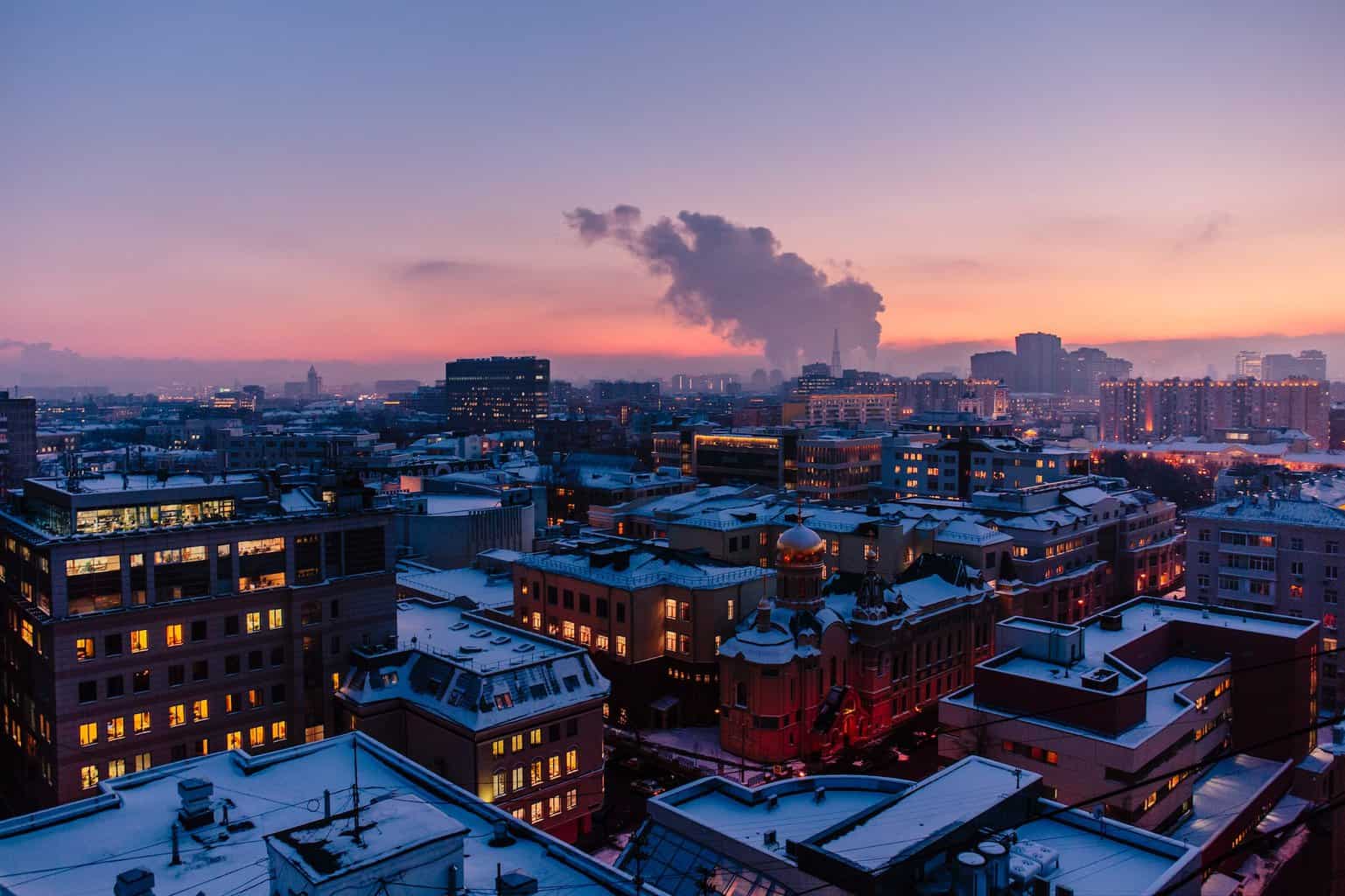
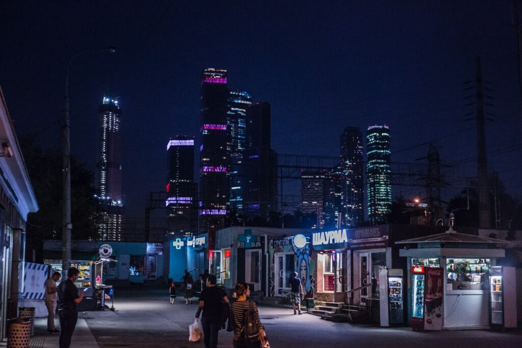
Many photographers find it easier to capture nighttime street photographs with high contrast. Always remember that you'll have more natural light sources when shooting outdoors, yet, less control than when shooting in a studio. You can also capture the following images using a high-resolution level:

It's a no-brainer that in minimal contrast images, the difference between the lightest and darkest area is narrow. So, you only want to use this
Photographers use low resolution on several images because it displays all the intricate details. Low resolution is the most suitable option for images requiring the utmost quality with super high resolution. Besides, it's great for a wide range of photographs that require a soft impression.
You can shoot some of the following images using a low-contrast setting:
Before delving into the ups and downs of low and high-contrast photographers, you should keep in mind that your
Generally, real estate photographers are known for their incredible attention to detail. You want to cover your subjects' intricate designs and aesthetics in every shot you take. This detail could be a sharp edge on furniture, the position, or the stairs' engravings.
Considering all i've covered, what type of contrast level will enable you to add such depth to your photos? You guessed right. A low-contrast image is the most suitable for real estate photography. It covers a wide color range, making all components in your image easy to spot.
High-key images have fewer details yet, pop more, while low-key images have fewer details with the same range of colors. The more suitable contrast level for real estate photographers is the latter because it is easier to capture all the details you need to ignite the quality of your image.