PFRE-Logo-white-bg
Reading
blue-triangle-element

Articles

PFRE is the original online resource for real estate and interior photographers. Since 2006, it has been a community hub where like-minded professionals from around the world gather to share information with a common goal of improving their work and advancing their business. With thousands of articles, covering hundreds of topics, PFRE offers the most robust collection of educational material in our field. The history of real estate photography has been documented within these pages.
All Articles
blue-triangle-element

Latest

Image banner for the February 2024 PFRE Photographer of the Month Winner Art Ibewuike, with a featured image of his winning photo titled "Living Room or Family Room""

Congratulations to Art Ibewuike, February 2024 PFRE Photographer of the Month! The theme this month was "Living Room or Family Room". Art Ibewuike - #895 Paul-Dan Dragoman - #898 Peter Wingfield - #900 Here's what Art has to say: Thank you so much for ...

Contest
blue-triangle-element

OVERVIEW

For over a decade, photographers from around the world have participated in PFRE’s monthly photography contests, culminating in the year-end crowning of PFRE’s Photographer of the Year. With a new theme each month and commentary offered by some of the finest real estate & interior photographers anywhere, these contests offer a fun, competitive environment with rich learning opportunities. 

Contest Rules
blue-triangle-element

CURRENT CONTESTS

View / Submit
blue-triangle-element

PAST CONTESTS

View Archive
Resources
blue-triangle-element

Resources

PFRE prides itself on the depth and breadth of the information and professional development resources it makes available to our community. Our goal is to help real estate and interior photographers be successful while bringing the community together and elevating the industry as a whole.
blue-triangle-element

Conference News

No items found

4 comments on “Entry 2”

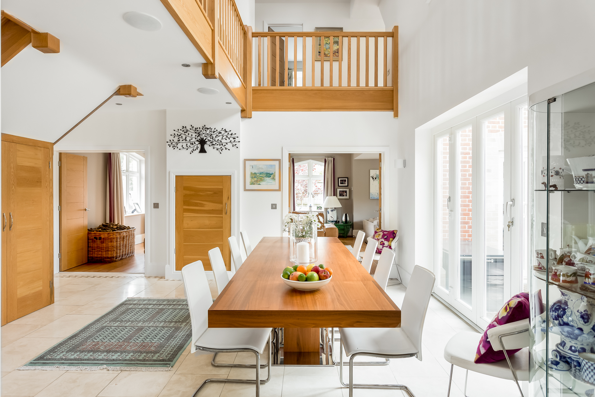
  1. Clean! Great color. I'm normally not drawn to images this bright, but I like what the photographer has done here. I really appreciate the way those super-cool doors are handled. You can really see the detail in them! The right side is maybe a bit hot, losing some detail in the floor there. Remove or clone out the keys in the door. I might like to see less of the right side (potentially losing that whole display case) which would help pull the table more to the right third and less in the center. Nice bright, airy feel that showcases the best features of this room. Well done!

  2. Very nice. I agree with Michael about the bright and airy feel here. Yeah, I really like that about this shot. But also agree that the right side is a little hot. The colors and white balance look great. Since dining tables so often require a little chair work, I'd have taken a moment to straighten/adjust their spacing (especially the ones on the right side). And not sure what that white line is on the left edge of the frame, but would have cropped it out.

Leave a Reply

Your email address will not be published. Required fields are marked *

magnifiercrossmenucross-circle