


Photography and media in real estate are changing faster than ever before, withthe adoption of AI, new technology tools, and the countless offerings they afford.What will be the deciding factors for real estate photographers who want to growtheir busin ...


Photographer of the Month - July 2020
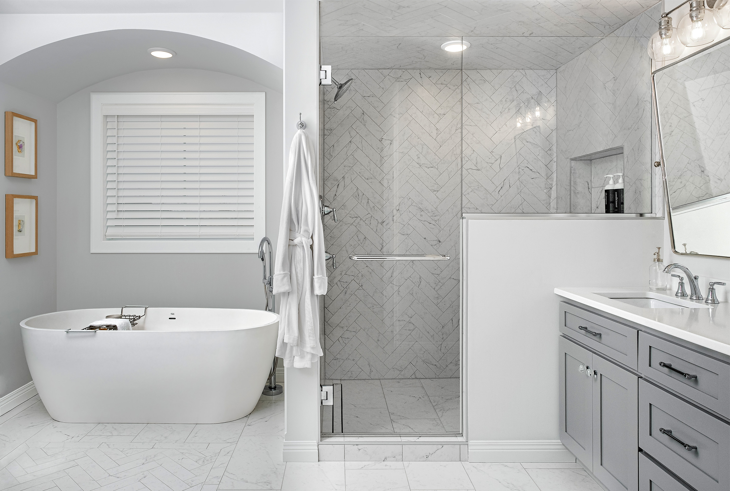
Entry 117
Daniel Francis
https://www.danfrancisphotography.com/


Well done! Nicely lit, nicely balanced, nice and simple staging.
Nailed the composition, the lighting etc. It is a very nice image. The ONLY thing I can think of is that window above the tub? What is the view? Feels a bit closed off because of that? Great job!!
Nice job on this. Would definitely like to see those shades opened (with window blown to obscure whatever unsightliness might be out there). And perhaps then let some of the window light flood in? To me, the lighting in the tub area could use a little more life.
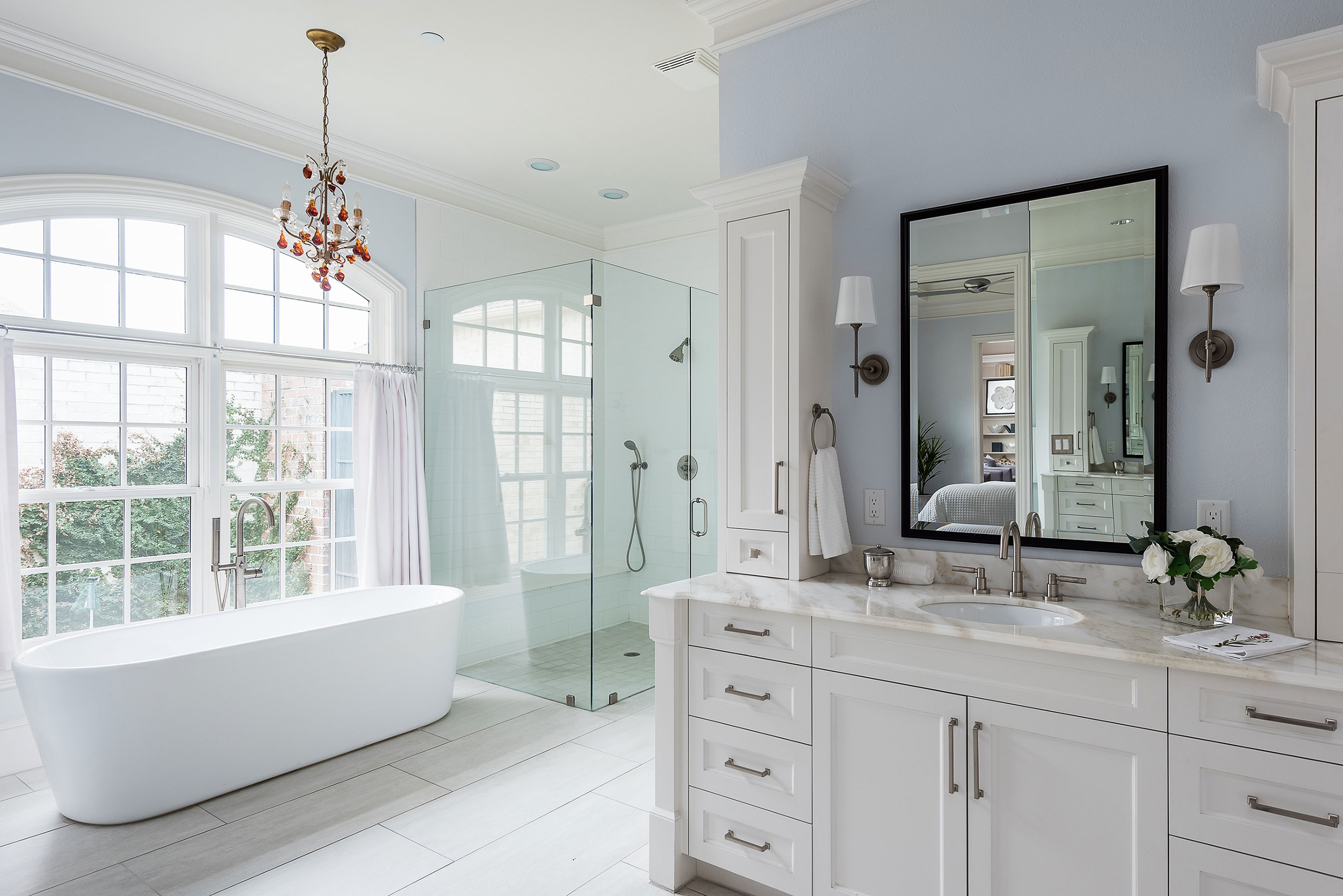
Agree with the "window closed" theme mentioned above. It's such a prominent item in the scene, and regardless of what was behind it, I feel like closing it up tightly only draws MORE attention to it. Also, because of the killing of that natural light, I feel there is too much reliance on the flash here. Those tilting mirrors are a pain. I tend to straighten them out, sometimes with a roll of TP hidden behind them. I know the straight angle this creates doesn't work for someone in front of the sink, but it works better for the photo for my tastes. I hardly ever feel like shampoos/soaps, etc... add anything to a shot and the ones here don't do anything for me.