


In today’s competitive real estate market, static photos are no longer enough. Buyers expect dynamic, engaging content that brings properties to life. Enter Reptov, a powerful new platform that transforms ordinary listing photos into professional marke ...


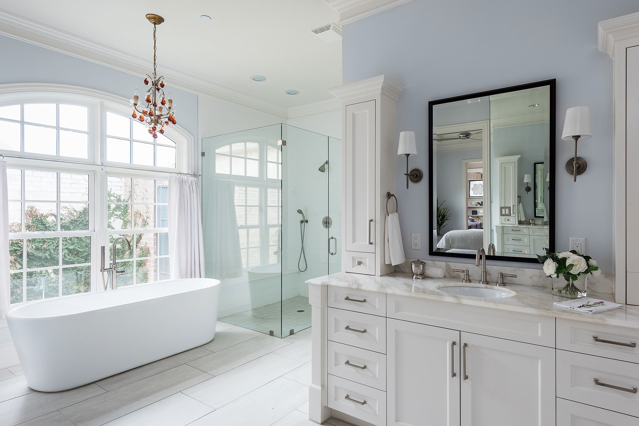
Nice job. I like how you've captured the bedroom and other vanity in the reflection. Window reflections in shower glass can be tricky. Might have been nice to make out a little more of the shower bench though. Overall though I don't mind reflections as much as I used to, and I this is one I am not really bothered by.
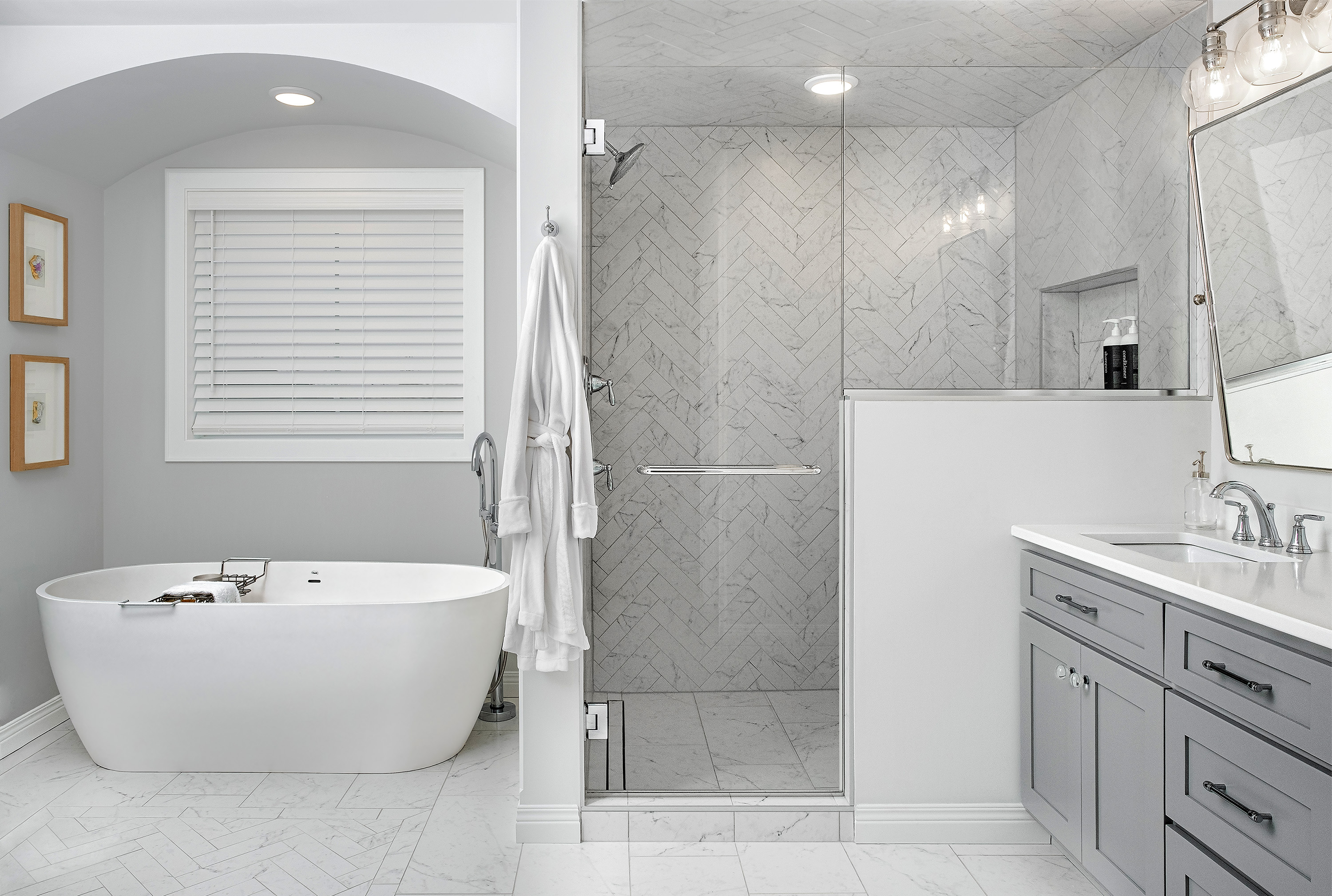
Over this has a nice feel to it, the composition is a bit tight though. Do we need the entire vanity? Give that tub a little more breathing room by sliding to the left and like Jenn says, give the shower bench a little more reveal and by doing this you would get the ⅔ - ⅓ composition as opposed to the 50/50 split. Lastly, tone down the windows, just a little more, they are a bit too bright. Nice image overall!
I like where Ethan's head is on this one. Less of the right side of that vanity and a bit more space for the tub and getting closer to that 2/3-1/3 comp. I really like the creative use of the mirror reflection to tell the story of the space. Unlike Ethan, I like the window treatment here (even the hot top transoms), and I don't mind the reflection in the shower. Overall, I think a lot of creative decisions were made well here. There's a feel and style to the shot that is familiar to me. If my instincts are correct, I would say, "bloody well done, mate". If my instinct aren't correct, that will make absolutely no sense.
Agree with Michael it does have a familiar feel ... Overall I love the comp idea but feel it is too wide... I don't believe it was necessary to get all of that right side vanity storage at the expense of stretching that tub out so much... Love the amount of descriptive info though the mirror reflection and I can see the height was chosen to preserve enough of the bed in the background to read as a bed ... Light is wonderful and capturing the ambient daylight to primarily light the room was a great choice. Near side of the tub is a bit cool in color, and its probably picking up a little of the blue walls reflection... maybe warm that up or desaturate a bit... Would have maybe tried to take some of the green out of the shower glass, not all but just a little to neutralize it a bit ... also could see a little more contrast .. but really this is a great job!!
Very pretty. Agree with so much of what’s already been said, particularly about the composition. Also, the camera feels a tiny bit high to me. Wish the left ~1/3 of the image were a little less bright, with a touch more detail/clarity.