


In today’s competitive real estate market, static photos are no longer enough. Buyers expect dynamic, engaging content that brings properties to life. Enter Reptov, a powerful new platform that transforms ordinary listing photos into professional marke ...


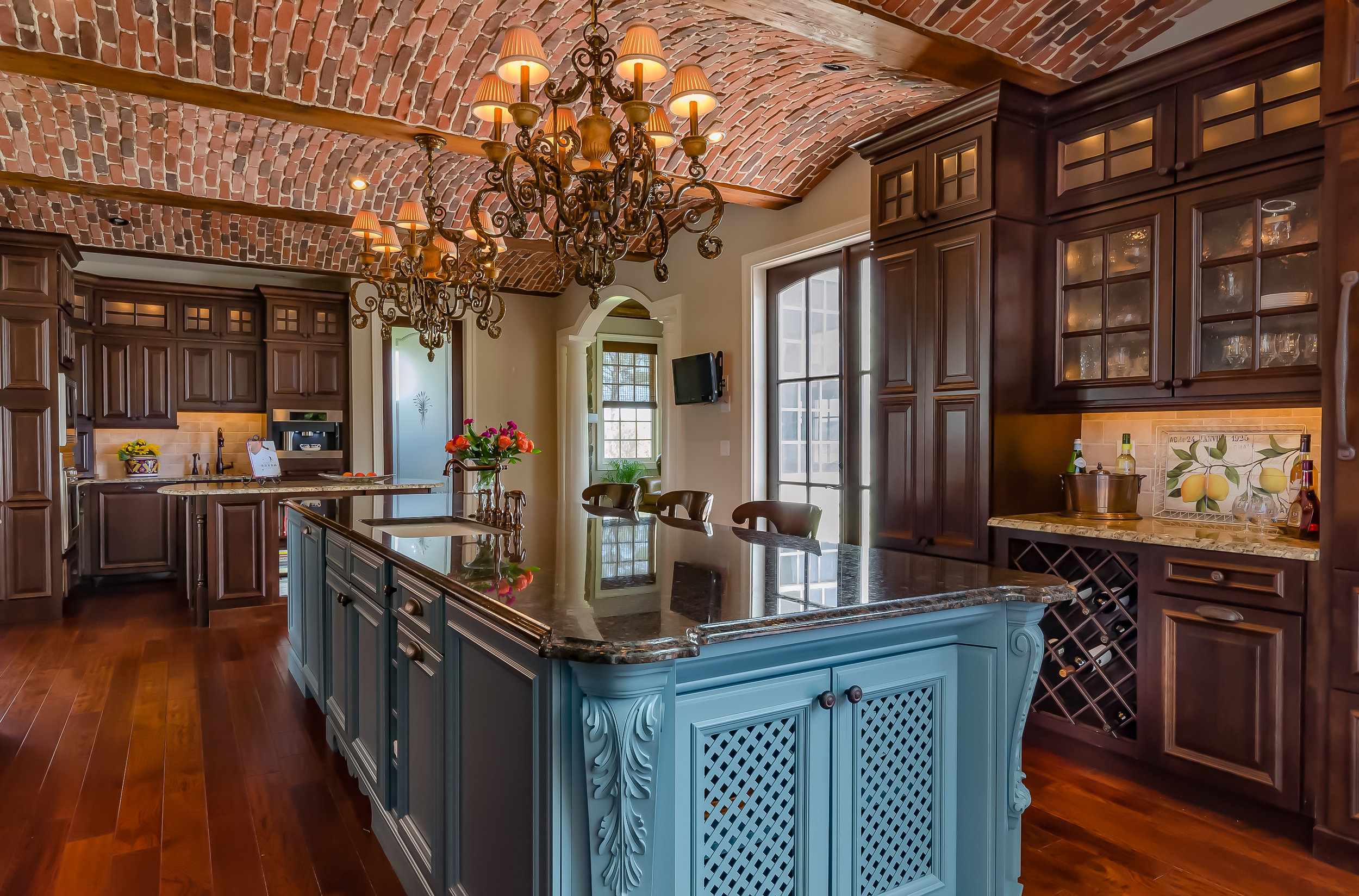


Very nicely done. I really like the fresh and airy feel of the lighting. It suits the design well, I think. I also like the choice of a straight-on view of the space. Though I can see how choosing the right spot for the camera might have been difficult. If a tilt-shift lens had been available, a case could probably be made for moving the camera a little to the right and shifting left. But I think the current position works. Though I kind of wish the chair, vase with greenery, and black light fixture weren’t creating such a strong vertical line in that part of the frame. Makes me wonder how it might look if the vase were nudged a little towards the right? A few small things: Maybe close the cabinet door on the left? It took me a moment to figure out what was going on over there. Also might have switched out the dark-throw-covered chair with the angled chair on the right. The throw is so obscured back there that it’s not reading super well. And I think if it were on the angled chair, it would serve as a nice counterbalance to the dark rectangle of oven. I’m not usually super picky about specks on the floor, but there are a few visible ones in the foreground that could be removed. Also wondering if the floor overall might benefit from just a tiny bit more structure/detail? Would also like to see the faucet turned a bit to the left, to eliminate its intersection with the edge of the white cabinet.
i really like this... but i agree with julie in the chair placements... i probably would have just pulled it out completely and moved one of the wood chairs in its place... i don’t think anyone would really notice a chair missing behind the table in center... beautiful treatment overall ... can’t decide if this is more of a dining shot or if kitchen was just so minimal that it needed the foreground to show off... i think there’s another angle here that would make me off a “kitchen” shot... albeit well done!
"Eagle Eye" Julie nailed all the staging comments I was thinking about. Literally every one. Overall I agree that this is a nice gentle, natural treatment that I feel aligns very well with the style of the kitchen. I, too, struggled briefly with the "Is it a dining shot or a kitchen shot?" question, but the lovely light and thoughtful composition won the day for me. Minor staging tweaks and maybe a little more "darks" to give it a bit more depth. Well done.