


In today’s competitive real estate market, static photos are no longer enough. Buyers expect dynamic, engaging content that brings properties to life. Enter Reptov, a powerful new platform that transforms ordinary listing photos into professional marke ...


Photographer of the Month - February 2021
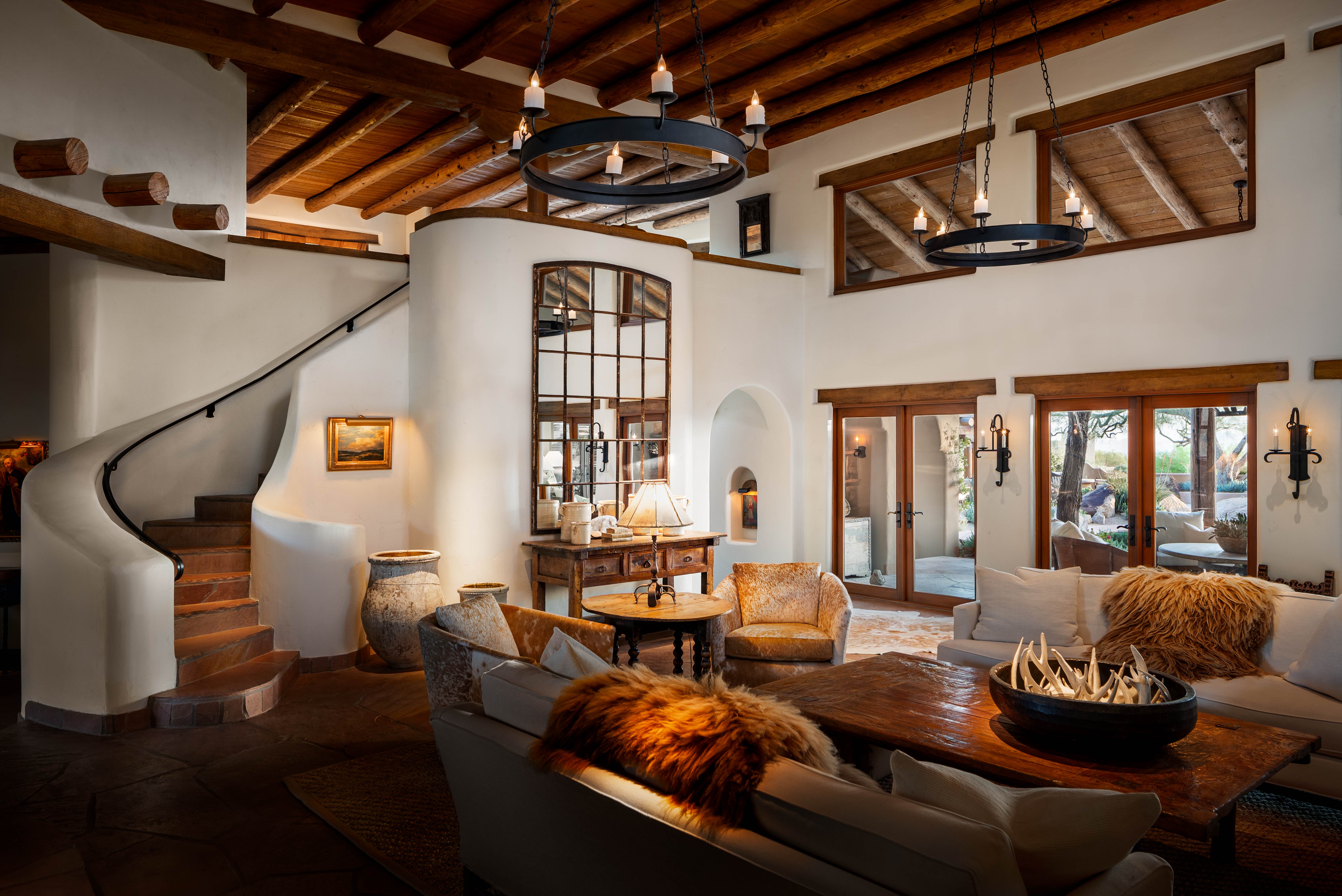
Entry 362
Austin La Rue Baker
https://austinlaruephotography.com/


Love the mood on this one. Nice!
there’s a lot to like here and i’m sure this was not an easy property to pull together! i do like the angle however not a fan of the furniture arrangement and it’s effect on the flow throughout .. wonder if the near couch could have been pulled closer to reveal a little more of the chair just behind? and the off center coffee table decor is throwing me a bit but i think it’s due to how everything is overlapping in the bottom third ... i n on now it’s not always wide or possible to move furniture on jobs but foe. contest submission i would expect it to be a little more purposeful and worked out... but i like the angle for sure i thin it’s great and a lot to consider when finding a comp with this architecture... overall great work... possibly a little heavy on the contrast and moodiness ... black point seems to fall off the chart in places and also seems a bit over saturated in some of the reds/yellows ... but i do think there’s a good deal that went well here
This is nice. I agree with all of Garett’s points, and with Colin as well. I like the mood here a lot. The deeply-shadowed areas are kind of distracting to me, though…I keep wondering what’s going on in those dark areas. Maybe the darkest shadows could be lifted just enough to reveal a bit of detail, while still preserving the mood? Would also like to see a little more breathing room along the left edge of the frame.