


In today’s competitive real estate market, static photos are no longer enough. Buyers expect dynamic, engaging content that brings properties to life. Enter Reptov, a powerful new platform that transforms ordinary listing photos into professional marke ...


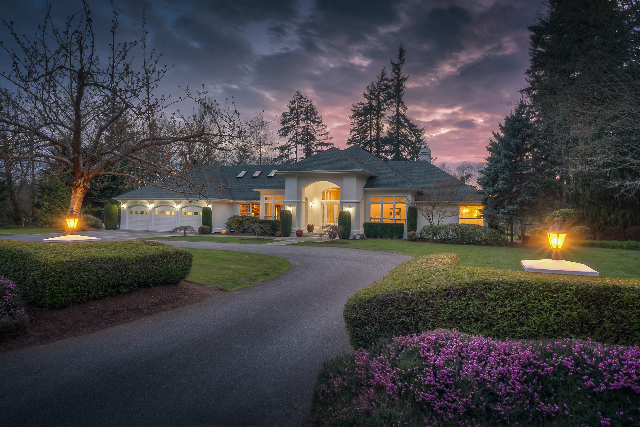
Nice image. Crisp and clean. Nice one point perspective. But my eye is just begging to see more of both the left and right hand sides of the house. The lighting is quite nice.
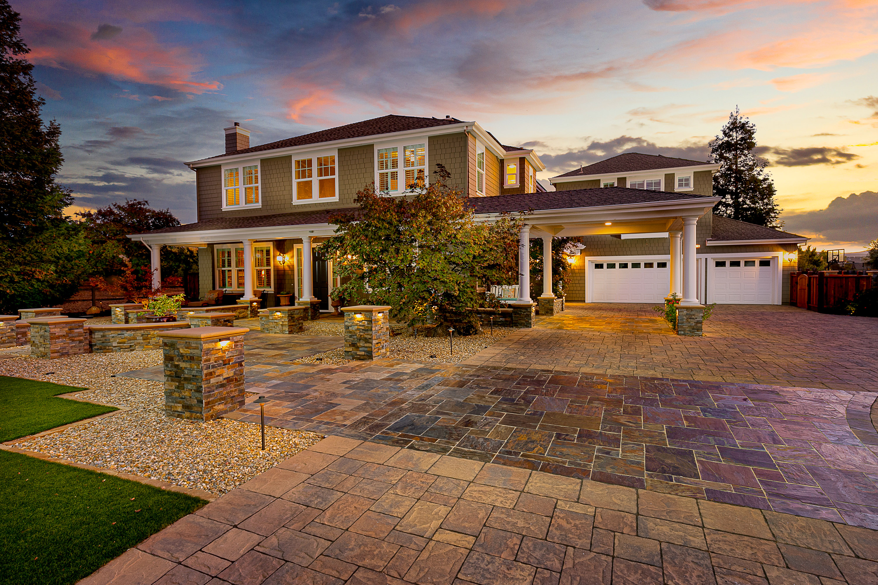
Nicely done. This looks like a great house and I like this perspective on it a lot. I think the exposure of the light fixtures and windows looks good, and I like the way the house is exposed overall. But in relation to the brighter foreground, I think the house ends up seeming a little dark. So would love to see the foreground grass, the low white wall, and the chunk of white in the driveway darkened somewhat. Thinking this would help to draw attention back towards the house. As it is, my eye gets a little stuck on the foreground and numbers. Maybe the entryway could be brightened just a touch as well? Also, was it possible to have opened the shuttered windows? And for my taste, the image looks a bit too heavily sharpened. I do really like this shot.
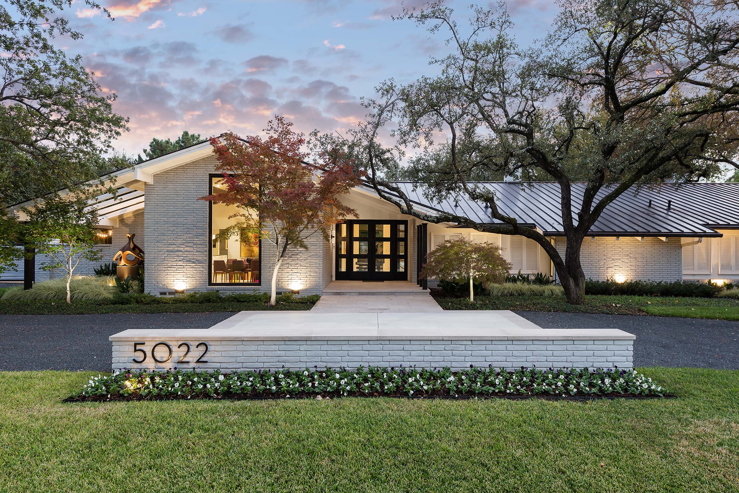
I like the processing on this image, but it falls a little short on the composition for me. It is too close and wide, making the brick feature wall in the foreground un-naturally large relative to the house. If there wasn't an opportunity to back up farther and use a longer focal length, then I would have tried something different altogether. Would be nice to see the entire width of the house, but I understand that isn't always possible.
Very clean and well done! Agree with julie about the sharpening... backing it off just a bit or maybe utilizing an unsharp mask would help... I do not mind this comp... I think being closer and not showing the entirety of the home, edge to edge, is appropriate for this shot... it really pulls the textures and the artwork at left into clear view... and fills the frame with the best attributes of the "face" that would certainly be lost on a wide distant photo... keeping in mind that drawing people to a photo these days is difficult as the photos are generally seen on a cell phone and presenting enough "readable" data into the shot is more important than ever to stand out from the crowd. I tend to think this way much more with my RE photos as of late -- I really want the most important pieces of the subject to be noticeable even in a small format and to stand out in the vast sea of listing photos... most showing nothing but negative space... so this is nice to me. Im not really getting much distortion anywhere here... I do believe Garey, that the brick half-wall is larger than one would think... but maybe your right... although It is just not triggering the UFWA vibes for me... anyway... it would look great here and in another photo from farther away as well, I'm sure the photographer provided some other views... I digress... lol! Overall well done... of course, I don't think the front of the home would be this bright, both foreground or house at this time of day so might have chosen a darker sky or something closer to just a little later than sunset...
Oh... darkening the foreground is a must in my opinion... much too bright