PFRE is the original online resource for real estate and interior photographers. Since 2006, it has been a community hub where like-minded professionals from around the world gather to share information with a common goal of improving their work and advancing their business. With thousands of articles, covering hundreds of topics, PFRE offers the most robust collection of educational material in our field. The history of real estate photography has been documented within these pages.
Congratulations Dave Koch, September 2025 PFRE Photographer of the Month! The theme this month was "Stairwell". Dave Koch - Entry 1099 Alyssa Huang - Entry 1095 Paul-Dan Dragoman - Entry 1098
For over a decade, photographers from around the world have participated in PFRE’s monthly photography contests, culminating in the year-end crowning of PFRE’s Photographer of the Year. With a new theme each month and commentary offered by some of the finest real estate & interior photographers anywhere, these contests offer a fun, competitive environment with rich learning opportunities.
PFRE prides itself on the depth and breadth of the information and professional development resources it makes available to our community. Our goal is to help real estate and interior photographers be successful while bringing the community together and elevating the industry as a whole.
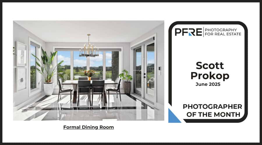
Lovely shot. I like this perspective a lot, with the doors on either side framing the view into the space. And I think the camera height was well chosen: It allows for just enough separation between the dining table and the sofa to distinguish between these two areas, yet the camera doesn’t feel overly high. The light has a nice feel to it…I like the darker foreground and brighter background. I wouldn’t mind seeing just a little more definition in the door to the outside (love that it's open!) Yeah, perhaps just a touch more detail overall along that back wall? And in the exterior view, as well as the pendants as well? As for the chairs, nice job wrangling eight of them! I think the one that’s touching the blue pillow could have been removed, though, for an even clearer view to the sofa area. And then the one next to it (overlapping the white pillow) could have been pushed in just a smidge towards the table. And if time allowed, maybe an adjustment to the lamp position? The wall/ceiling line on the right seems to be sloping…not sure of the cause, but to me it’s a little distracting.
YEah, I like this a lot ...very nice composition - packing a lot into the frame but successfully done and very descriptive of the space without a million angles! I consider that a success in RE shooting! Love the light... not minding the window luminance... I like that it is very hot ... its adding to the feel of the light direction and hiding what's out the window (yet not completely) very nicely done... really like the light directionality here!
Agree with julie on the back wall distortion... could be the structure though as I don't see a lot of pincushion in other areas... Ahh.. the chairs, that was going to be my only nit pick... julie nailed it... those two dining chairs in the center ... was going to say scoot the foreground one to right a little past the one behind it but removing as julie said is the way to go! Those are such a pain... round tables with lots of chairs... they take extra time and extra adjustments...
I dig it! I often say, "Just because you can fit 8 chairs around a table doesn't mean you should." In this case, it's adding to an already crowded scene for my tastes. The darker foreground pulls the viewer through the scene to the brighter background nicely. Nice touch with the open door to the patio (PS - I want a lemon tree!). I agree there's some wonkiness going on with that back wall and the light fixture over the table, but it's "real estate" and overall the lovely directional light and composition outweigh the nitpicks. To be fair (because I mentioned it on another photo), it feels more like a "casual breakfast area" rather than a "formal dining room" to me, but maybe that's an issue with the monthly theme. Maybe "Dining Area" is a better name?