PFRE is the original online resource for real estate and interior photographers. Since 2006, it has been a community hub where like-minded professionals from around the world gather to share information with a common goal of improving their work and advancing their business. With thousands of articles, covering hundreds of topics, PFRE offers the most robust collection of educational material in our field. The history of real estate photography has been documented within these pages.
Congratulations Dave Koch, September 2025 PFRE Photographer of the Month! The theme this month was "Stairwell". Dave Koch - Entry 1099 Alyssa Huang - Entry 1095 Paul-Dan Dragoman - Entry 1098
For over a decade, photographers from around the world have participated in PFRE’s monthly photography contests, culminating in the year-end crowning of PFRE’s Photographer of the Year. With a new theme each month and commentary offered by some of the finest real estate & interior photographers anywhere, these contests offer a fun, competitive environment with rich learning opportunities.
PFRE prides itself on the depth and breadth of the information and professional development resources it makes available to our community. Our goal is to help real estate and interior photographers be successful while bringing the community together and elevating the industry as a whole.
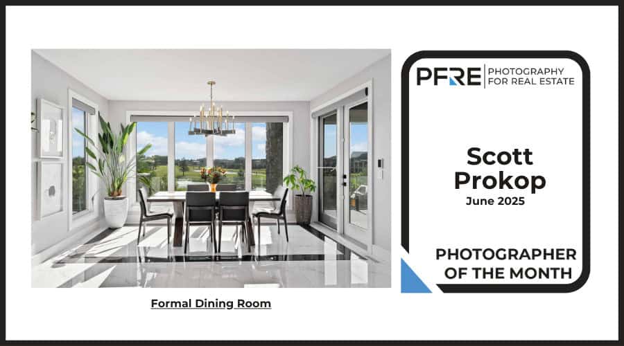
I like a lot of things about this one! Strong composition. Killer window pull. Love the way the pendants on the overhead fixture get brighter as they get closer to the window (as they should!). Great directionality of light. I think a lot of smart, tasteful decisions were made in creating this image to capture a very natural, very pure experience. Bravo!
I like this a lot. Really interesting composition. This is very nicely done overall, but I’m having a few reservations about the lighting. The window view seems just slightly dark to me. (Or maybe it’s the saturation level?) I love seeing what’s outside, but something about the window feels a tiny bit off to me, in relation to the interior light. Or maybe it’s the brightness of the ceiling and wall around the doors that’s causing the window view to feel a touch strong to me? Makes me wonder how it might look if the ceiling and far wall were a little less bright/a little more shadowy. Also, something about the light hitting the chairs on the left and the light hitting the pendant globes feels a little incongruous to me. Guess I’d expect the light on those chairs to be a bit less bright and the shadows on the near globes to be slightly less intense (especially since the near globes appear to be further from the camera than the near chair...?) Sorry, I know I’m nitpicking the light to death here! It just doesn’t feel perfectly seamless and natural to me. And I so badly want it to, because I love everything else about this photo. (And sincerest apologies if I’m perceiving things – flash? – that aren’t there!)
Well, I just looked at this on a different device and the window view and wall/ceiling brightness didn't bother me at all. So it's just the light hitting the chairs and the shadows on the globes that I'm wondering about. Sorry to have been unduly nitpicky!