


Congratulations Dave Koch, September 2025 PFRE Photographer of the Month! The theme this month was "Stairwell". Dave Koch - Entry 1099 Alyssa Huang - Entry 1095 Paul-Dan Dragoman - Entry 1098


Photographer of the Month - November 2020
Entry 262
Jacob Mollohan
https://www.mollohanphotography.com/


Nice little vignette. I'm curious to see what was available to the left? I might want to get a peak of what is outside that door. I'm assuming that it's a slider to a rear garden area? If we showed a bit more on the left, putting the light and greenery on the left vertical third, it might add some interest. Staging on the shelves needs tweaking and thinning. Not loving those succulents hiding behind the upright post. And I can't believe I'm saying this, but could it stand to be a tad brighter? Overall, I like where the photographer was heading with this one.
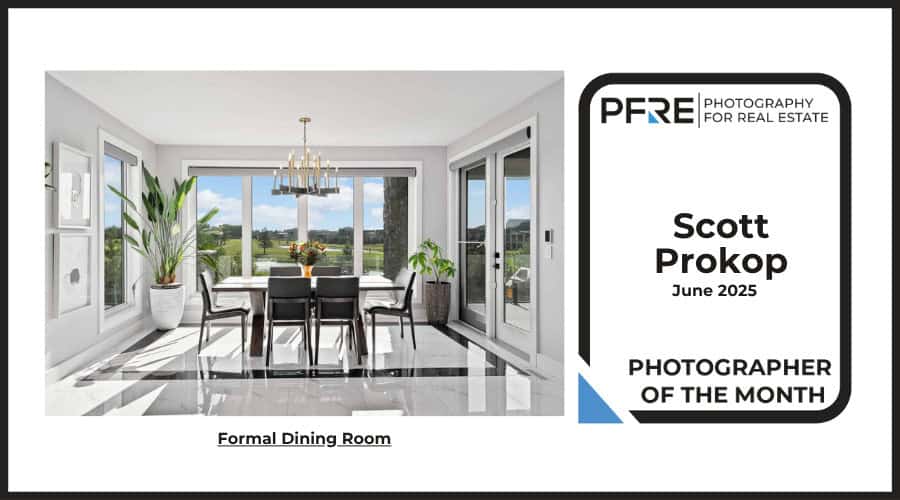
This is very nice. Completely agree with Michael’s comments. I’d love to see the upper left corner dragged left and up, for a few reasons: To me, there’s some tension in having the light fixture so close to the edge of the frame, so by showing more along the left and top, I think the composition might feel a little more relaxed/balanced. And by including more of the table, the table would be given more weight in the scene (as it is, I think the sideboard commands a little too much attention). Also, if we were to see some of the (presumably bright) door glass, along with a touch more of the light-colored ceiling, I think it might further help balance the composition.