


In today’s competitive real estate market, static photos are no longer enough. Buyers expect dynamic, engaging content that brings properties to life. Enter Reptov, a powerful new platform that transforms ordinary listing photos into professional marke ...


Photographer of the Month - September 2020
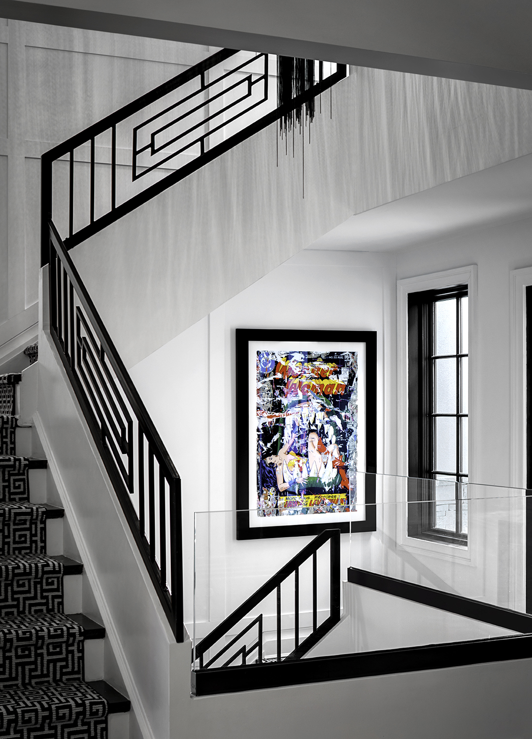
Entry 199
Brian Berkowitz
https://brianberkowitzphoto.com


Love the art. Love the way the runner compliments the railing. Love the hint of that fringy fixture and the cool shadows it's casting on the wall. I do not love the way the far railing intersects the artwork. A little higher and we'd get a sliver of white between the two objects. I don't think I love that doorframe (?) on the right. Would rather have slightly more on the left, giving us a tiny bit more stairs. Regardless, a nice stylish treatment of an intriguing space.
This is so nice. Love the light, the contrast, the interesting lines and shapes. And I really like the choice of camera placement. But one thing I’m kind of wanting to see is a bit more included around the edges of the frame, especially along the left and bottom. Yeah, I’d be curious to see what impact it might have on the shot if we could see more of the stairs, and that cool geometric pattern in the carpet (it kind of nicely echoes both the shapes in the railings and the panes of window glass). Wondering if this might help ground the left side of the shot just a bit more? Small thing: I like the highlight along the top of the railing where it crosses the frame of the painting…keeps the railing from completely blending in with the picture frame (I can see how trying to get the dark railing set against a white background might have compromised the camera height too much).
very nice.. great subject to feature and Im really sure it was difficult to compose on site... very well done keeping the stairs top and light fixture in frame while balancing the lower portions... I don't know, I keep wanting to move more left and pan right just a bit to see a little of that door? or window? on edge of frame... I know the photographer was probably going for the painting being in center and lining up with the centered light hanging at top but I think it would be ok to bring them slightly off center and give our eye a space to travel out of the frame... also I think the top of the middle railing, intersecting with the rails just behind it is bothering me more than the where the background rail sits with the painting... want to see just a little more stair treads and the separation of those two elements ... also may be a tad heavy on contrast... love the blacks but feels quite heavy overall ... but that's just my juju... this is well done ...
This shot is really nicely done. I like the contrast, although I wish the whites weren't so desaturated. It feels a little over-processed to me, but I can get past that. Just a preference of mind, not to completely remove all color from white walls. I do like the composition, and without being there myself it's hard to say what I would have done, but one thing has me very curious. This angle is not quite as angled as I'd like to to be, and I wonder if there was a slightly different composition putting the camera to the left of where it is. I think that would give us more of the window, might help separate the railing from the art, and would also show us more of what's upstairs (including the chandelier). The chandelier, as it is here, I find very distracting. Nothing you can do about it, of course, but I think that is the main thing making me imagine slight changes to the composition. SLIGHT, mind you. Of course, that may very well have been impossible. It also would require moving in slightly closer and shooting a little wider, which may make more problems than it solves. I guess what I'm saying is, I wish I was there because this is a cool shot 🙂