


In today’s competitive real estate market, static photos are no longer enough. Buyers expect dynamic, engaging content that brings properties to life. Enter Reptov, a powerful new platform that transforms ordinary listing photos into professional marke ...


Photographer of the Month - June 2020
Entry 15
Tacey Jungmann
https://www.facebook.com/Snowberryphoto/


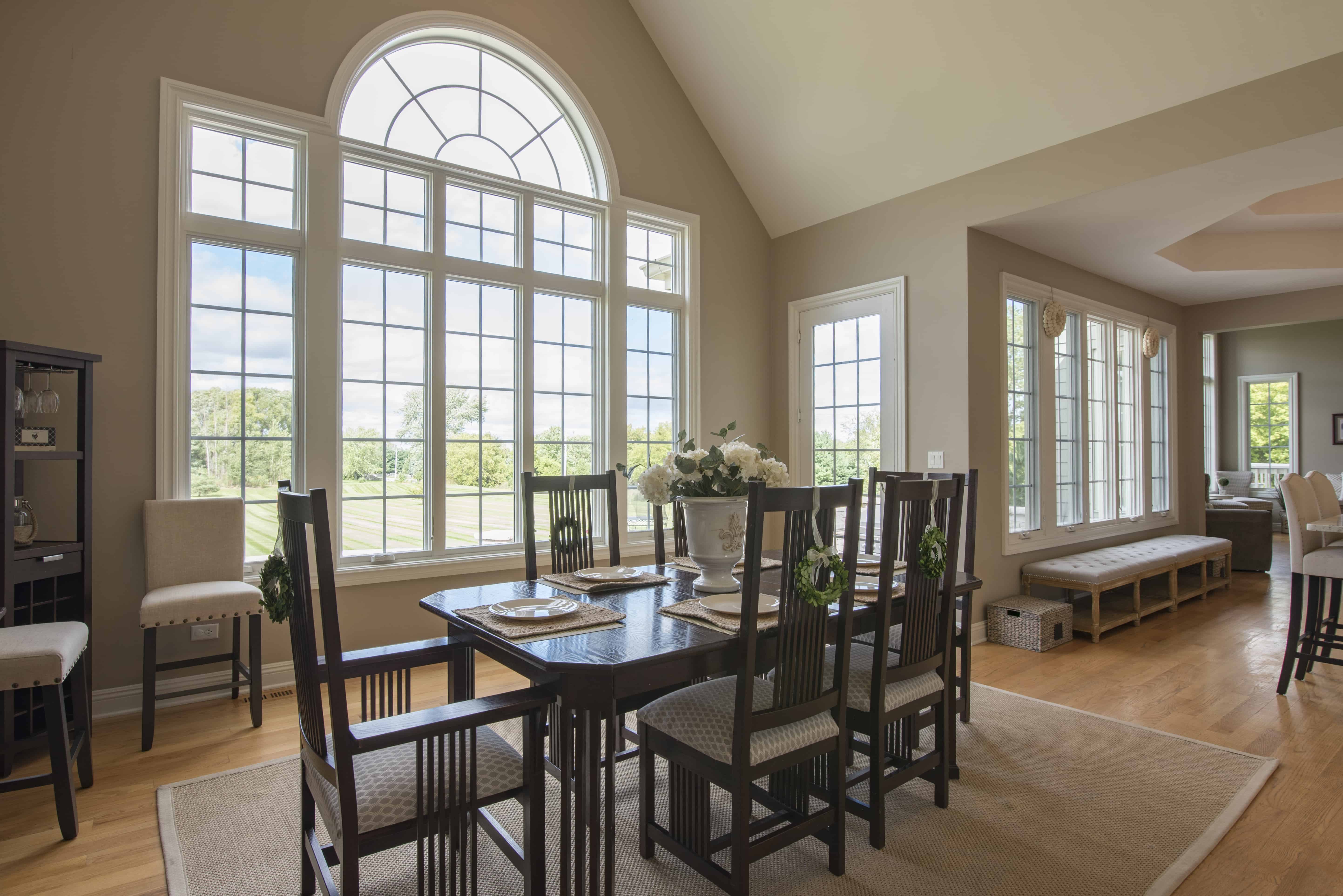

Beautiful light and overall pulling together... nice comp ... my only nit is that the statute behind the table is crowding the opened door a bit but i won’t hold that against the photog as i wouldn’t be touching it on site either for RE! possibly moving the doors a little more closed would help but i love what’s going on here!
Nicely done. I like this a lot, and agree with Garett’s comments. A couple thoughts: To me, there’s a slight tension happening in the composition. I’d love to see some breathing room given to that chair on the right, and I don’t need to see quite so much of the hall. Makes me wonder how this might look if the camera were moved a bit to the right? (with an adjustment to the position of the chair on the left end of the table, to prevent any blocking of elements over there). Also, the light hitting the beam and wall/ceiling at the upper left: It looks a bit hot and flat up there. Is that from flash? Or was there a skylight in that area?
Really nice image. I actually like the wider view as I think this room lends itself to it well. The architectural elements are on full display, and there's a lot of context there while still feeling very much like a photo of a dining room to me. I think the light is handled really well and has a good feel to it. Echoing Garett's comments, I agree about the statue. It's an unfortunate oversight, but if shot for RE I know that it could not be moved, and I like Garett's idea of closing the door a little more so they don't intersect. Otherwise, I would have cloned it out for the contest entry. The biggest oversight however, is the chair touching the right edge of the photo. It definitely needs some breathing room. Still, I think this is my favorite photo this month for its thoughtfully wide composition and consistent and subtle, polished look and feel throughout. Very well done.
Thanks for the thoughtful commentary. Yes - that statue about killed me - this was for RE and I couldn't budge it. I thought about pulling it from the competition image but wasn't sure about the empty space it would create. I could have tweaked the door to add a smidge of space there. That tension on the right chair - absolutely spot on CC. I loved the lines down the hallway and had the chair with enough room in the original image, but the verts were of. In final I went for verts over more breathing room and did a whole bunch of cloning to build up the window frame above the chair right. I wish I'd had a wee bit more space - and that I'd used my tilt shift for this one.