


In today’s competitive real estate market, static photos are no longer enough. Buyers expect dynamic, engaging content that brings properties to life. Enter Reptov, a powerful new platform that transforms ordinary listing photos into professional marke ...


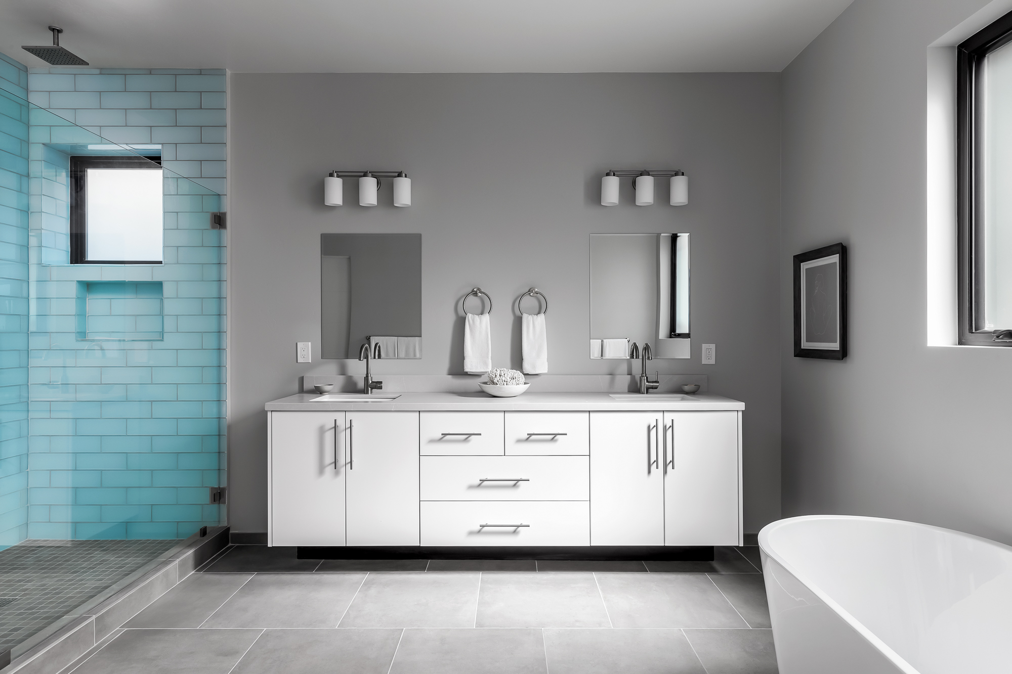
So good! Almost looks like a rendering! Would love to see what it looks like with some color (props) on the right to give the color some balance. Nice work!
Love this... really good job controlling the light and the colors... super clean and still has some mood for a relatively lightly staged bath... do wish for some extra color maybe a blue towel on the tub or something to echo the shower tile... make sure you keep that handy before the shoot next time.. lol!! SO many times I come across these modern spaces and the owners or stagers have used NO color in the items added... and the one thing it needs is more color to balance that shower tile... but that's not the photogs fault for a listing photo... just thinking out loud lol! Great work!
I really like this. Agree with Jenn and Garett that adding some color on the right would be a great touch. I like the composition overall, and the camera height looks good (it can be so tough to balance the camera-height needs of both the tub and the vanity in a bathroom shot!) Wish the camera were moved forward maybe an inch, though...I’m kind of dying for a tiny bit more space between the edge of the tub and the vanity, and also wouldn’t mind if the tub were occupying a little less of the frame, relative to the vanity. I like the feel of the lighting overall, but I’m a little distracted by what seems to be some inconsistency in some of the shadows (shadow direction, and hardness vs softness). Takes me out of the photo and makes me wonder about the technique (apologies in advance if this is purely ambient!) Small thing: wish there were more detail in the artwork.