PFRE is the original online resource for real estate and interior photographers. Since 2006, it has been a community hub where like-minded professionals from around the world gather to share information with a common goal of improving their work and advancing their business. With thousands of articles, covering hundreds of topics, PFRE offers the most robust collection of educational material in our field. The history of real estate photography has been documented within these pages.
Congratulations Dave Koch, September 2025 PFRE Photographer of the Month! The theme this month was "Stairwell". Dave Koch - Entry 1099 Alyssa Huang - Entry 1095 Paul-Dan Dragoman - Entry 1098
For over a decade, photographers from around the world have participated in PFRE’s monthly photography contests, culminating in the year-end crowning of PFRE’s Photographer of the Year. With a new theme each month and commentary offered by some of the finest real estate & interior photographers anywhere, these contests offer a fun, competitive environment with rich learning opportunities.
PFRE prides itself on the depth and breadth of the information and professional development resources it makes available to our community. Our goal is to help real estate and interior photographers be successful while bringing the community together and elevating the industry as a whole.
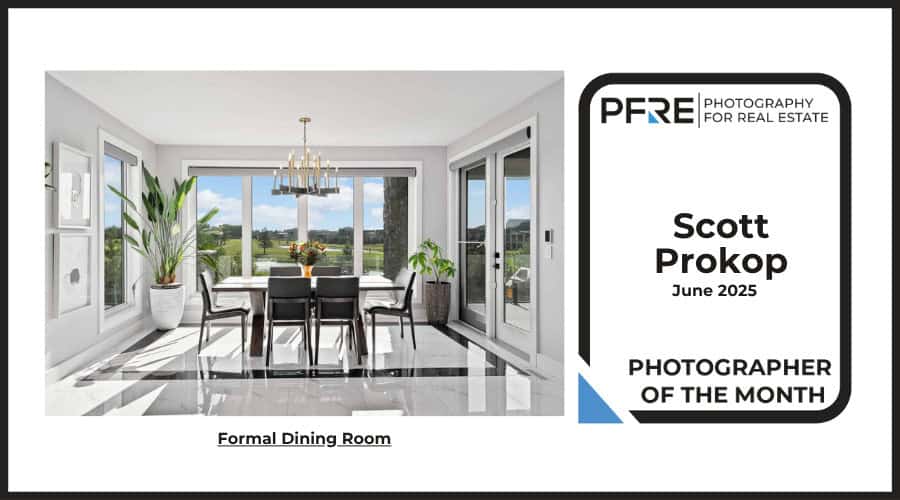
beautifully clean! although blue around exit door in background might could be desaturated or warmed a bit more … also my big issue is just … waaay too wide … we don’t need to see all the way to the wall on right and even half the bedside table and lamp in foreground … in fact showing so much of that light is really almost blocking the view to the main attraction … also the table would be communicated just fine without seeing all of it … just the front edge and chair are all the mind needs to know it’s there and probably comities off the frame … also by zooming in and composing a little tighter will diminish the extreme sloping floor as well as get rid of the what appears to be a giant table and light in the foreground…largest things in the photo …


beautifully clean! although blue around exit door in background might could be desaturated or warmed a bit more … also my big issue is just … waaay too wide … we don’t need to see all the way to the wall on right and even half the bedside table and lamp in foreground … in fact showing so much of that light is really almost blocking the view to the main attraction … also the table would be communicated just fine without seeing all of it … just the front edge and chair are all the mind needs to know it’s there and probably comities off the frame … also by zooming in and composing a little tighter will diminish the extreme sloping floor as well as get rid of the what appears to be a giant table and light in the foreground…largest things in the photo …