


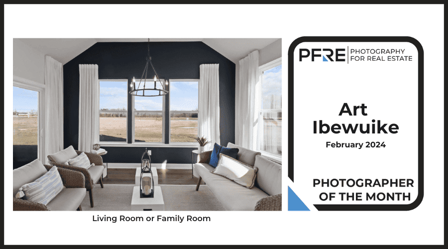
Congratulations Alex Vincent, March 2024 PFRE Photographer of the Month! The theme this month was "Kitchen". Alex Vincent - #906 Yvonne Raaijmakers - #909 Peter Wingfield - #902 Here's what Alex has to say: Thank you for the award of Photographer of th ...

As an Amazon Associate we earn from qualifying purchases.
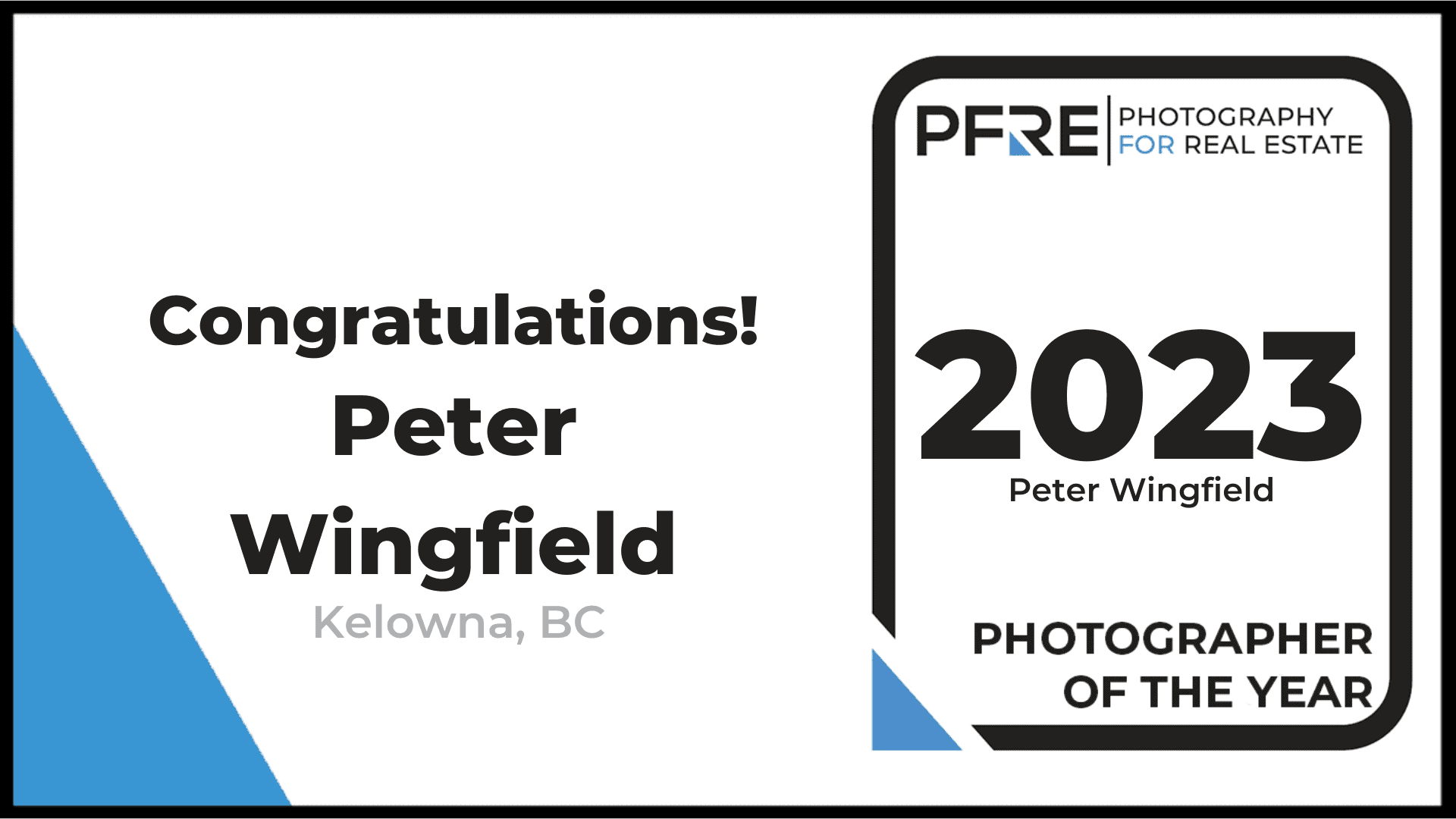
 This year's award of PFRE Photographer of the year goes to Barry MacKenzie of London, Ontario.
Here are the points awarded by the jury:
This year I have a special feature. Since I didn't post these in the contest flickr group during the jury voting the usual commenting and analysis couldn't go on (next year I'll put them in the flickr group) so Scott Hargis has written the following detailed analysis of all the photo contestants for this year's Photographer Of The Year - Thanks Scott for all the time you put into this analysis:
Sebastian Erras, November 2014: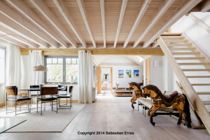 First off, congratulations on getting not one but TWO photos in the winners' circle this year. Luck clearly has nothing to do with Sebastian's success, he's just really good. I'm particularly impressed with his impeccable touch with highlights. He's not afraid to blow them out, but he's also very good at holding detail just below the point of clipping. It gives his images an airy, light feeling that is well suited to the architecture, especially in the case of this modernist structure with all the blond wood and white walls.

This photo works well because of a great combination of light and composition. The rafters absolutely SUCK my eyes into the center of the image, which is also the brightest part of the photo (other than the extreme left edge). Once I'm there, I can notice the delightful carousel ponies and the dining room table. The staircase does double duty, framing the shot on the right -- if it were bare wall over there my eye would just float right on out in that direction -- and it also gives me another place to want to explore (notice that it's also brighter upstairs).
My one serious critique of this photo a month ago was the corner of the glass table in the lower left. I still feel like there needs to be more of it, or better yet, something else. Right now it just doesn't immediately "read" as a table. And, I'd prefer to see something more massive, to help balance the composition a little more. There's obviously more "room" behind and to the left, so I want to see something that hints at what might be going on there, and this slice of glass just doesn't accomplish that, for me. Even seeing part of a dining room chair or two would do the trick. But -- that's a minor thing. This is an excellent photo!
Mike LeLand, October 2014: Another excellent composition. With all that fantastic landscape, the urge to go wider must have been powerful, but Mike kept it very controlled, and the photo is really strong compositionally as a result. By using a longer focal length, the mountains appear larger, the structures are not distorted, and I have no confusion as to what I'm supposed to be paying attention to.
The roofline jutting into the shot from the right tells me that there's an outbuilding, but again, this photo is about the pool, house, and mountain. I see exactly enough of the outbuilding to register it, recognize that it's clearly part of the same property, and then get past it. The line of the roof takes the eye down towards the pool, and the elongated tip of the right-hand end of the pool helps create a little circular movement around a Rule-of-Thirds cross that keeps the eye occupied on the patio. The steps of the pool are near another Rule-of-Thirds cross.
I'm finding the sky to be a little bit suspicious looking. There's been some Photoshop work done up there...but it's not completely out of place given the light. It might have been worthwhile to clone out the bit of wall at the bottom right corner and replace it with foliage.
Well done for sure -- and a great example of a "Twilight" shot that's not too late. This is much more interesting and 3-dimensional now, with the sun still creating highlights and dramatic shadows, than it would have been later on.
Aaron Flores, September 2014: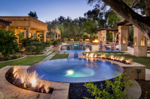 I liked this image a LOT when I voted for it in September. And I still do! Another excellent example of a photographer who's got great compositional instincts; Aaron resisted the urge to go UFWA even though I'm sure there was lots of pretty stuff to the left and the right of this frame. As a result, there's little distortion, and the distant lawn and tree at image center hasn't shrunk down to miniature status. You get the sense that you could actually shout to someone over there and they'd hear you.
I also appreciate that Aaron didn't photoshop in a Hawaiian Sunset -- this sky looks 100% believable and doesn't distract me from the actual subject of the photo.
As I mentioned in September, I think removing the cigar ash from the foreground would be a good idea, and PFRE ethics aside, I'd absolutely remove the electrical switch thing from the right side of the hot tub!
Kate Benjamin, August 2014: This is a photo that has definitely seen some "work" -- but it's been done quite skillfully. Dappled sunlight and shade can be a nightmare, and no camera was going to hold detail in both the shadows and the highlights in this situation. I don't know what Kate did to get to this result, but it seems to work. A trained eye knows that something's amiss, but it's also PLEASING and hasn't been overdone to the point of being a cartoon. Part of the success is that Kate allowed a few highlights to blow out, and a few shadows to be clipped -- which plays right into the brain perceiving this as "real" -- because that's how I would experience it in real life. I intuitively know that the very brightest patches of roof, and clouds, are going to be so bright I can't even squint my way into detail, especially when I are still able to see (dimly) into the shadowy recesses under the eaves. Kate has done a great job balancing all of this.
On to the composition: again, carefully chosen. Rather than a one-point on the front door, Kate shot from the side and the house looks vastly larger, and more interesting. Instead of a straight roofline I get multiple dormers and the promise of much more. The large tree is perfectly positioned against the transition from brick to siding and doesn't cover anything that would leave me wondering.
Ling Ge, July 2014: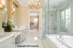 If there's a recurring theme among this years' winners, it's that they mostly avoid the UFWA look. Here's a good example of a photographer who found a way to really show this large master bath but without breaking out the 10mm lens. As a result, the edges of the photo don't appear too stretched, and the view into the adjoining bedroom isn't so tiny as to make me think it's miles away. Everything in this shot looks proportional.
Ling did a smart thing by composing the shot as a one-point perspective, and showed just enough of everything to answer all the questions I might have about this room. I get enough of the nearest sink to understand that it's a double vanity (his and hers sinks). I get the large soaking tub with the fancy hardware, but not so much that it becomes an over-emphasized drag on the rest of the room. I see that there's a huge walk-in shower enclosure with that cool basket-weave tile and a "rain" head, and if the viewer is savvy enough, you recognize that there's an enormous window over the tub. Even a casual viewer is going to register, unconsciously, that there's a very big window on the right side, whether they "see" the reflection and figure it out, or not.
Then there's the view into the bedroom. This is both my nit-pick, and my praise: I wish there was a little more furniture in there to help sell the luxury story of this house. But, I can safely assume that this was a staged property and Ling didn't have much to work with in that regard. But what strikes me about the view through the doorway is how perfectly THAT little photo is composed. If you draw a 4x5 "box" around the far wall of the bedroom, as framed by the door, you see that the square window and the mirrored dresser occupy "Rule-of-Thirds" positions. It's like having a little still life fine art piece in the center of an already killer bathroom photo.
There are three little things Ling should have done here: first, clone out the reflection of his light stand in the mirrored dresser. Second, straighten the lampshade above it. And third, either move the camera a few millimeters left, or photoshop out the tiny sliver of light at the left edge of the doorframe (where the second bedroom window is).
Tony Colangelo, June 2014: Here's a shot that's both easier, and harder, than it looks. First off, Tony did a great job of making a relatively small space look bigger (I can hear his client now..."Make the rooms look bigger!")
He chose a classic one-point perspective and then made a pretty ballsy decision to de-emphasize the fireplace and instead emphasize the staircase! Many, many photographers (me included) would have been very tempted to go wider and capture both. Tony shows me just enough of the fireplace so that I know it's there, and have a very good sense of it's style, but he's assuming, correctly, that this photo will be viewed as part of a set of images, and the photos before and after this one will likely feature the fireplace in all its glory. This shot is about the flow of the house, and it's architecture - which in this case is worthy of the attention.
He's managed to make this modest living room look bigger without resorting to his UFWA lens (if he even owns one) by:
This was a difficult shot because there are big, very bright windows to expose for, including one that's staring the photographer right in the face (the dining room window). That one represents a huge reflection issue. It seems clear that my favorite technique was used on the stairwell -- a slightly warmed strobe bounced off of the second-floor ceiling! How can you NOT want to walk up those stairs?!
I'm guessing that either there was a window directly behind the camera, or else Tony bounced a flash off the high angled ceiling directly above the camera. Or maybe both! Either way, the result was a slightly over-lit, rather flat foreground. Pulling the blinds, and backing off from that flash (and perhaps augmenting it with some directional light from camera right) would improve this shot quite a bit.
Sebastian Erras, May 2014: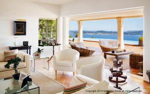 Again with the well-controlled highlights. Sebastian has an easily recognized style, a fact that must serve him very well in terms of differentiating himself from other photographers in his area. I can be sure that the view was masked in from a separate exposure, but Sebastian is not going to succumb to the desire to insert an UNDER-exposed view, which would scream "FAKE!" to the viewer. What I have here is believable, and of course the view is really what this photo is all about; everything else is secondary.
The camera POV was really well chosen -- Sebastian had to think about how the permanent features lined up and interacted with each other (e.g. the columns and the pool, and the landscape beyond) as well as how the furniture lined up. Furniture can be moved, although there are limits to that, practically speaking, in PFRE. In this case, though, I think removing a few things would have been worth the effort. Getting the camera up high fills the doorway with pool and ocean and views --- not sky.
Still, this is a very well-produced photo that seems to be 100% true to the style and "feel" of the space.
At risk of sounding like a broken record -- please note that because Sebastian composed this shot with a relatively long focal length, and did not try to show three walls AND the view, I can actually SEE the view out there. Had this been shot with an UFWA lens (say, <24mm) the view would have shrunk to something about 10 pixels high and utterly forgettable.
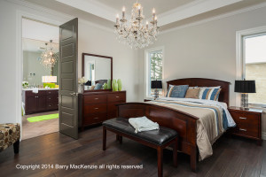
Barry MacKenzie, April 2014:Classic real estate
If you've never tried it, the amount of light you have to pump into dark wood grain like this is intimidating. And as such, it's very hard to avoid flattening out the photo. Intuitively, I expect the light in this room to be flowing TOWARDS the camera, from the two windows; but lighting the wood tends to reverse that, and if taken too far it gets very dissonant, very quickly. Even the most casual layperson will know, at a gut level, that "something's up" and the image simply won't feel right. At best, it'll be kind of forgettable.
Barry did about as good a job as can be done in a situation like this. In any other genre of
I think the camera's POV is pretty great. It's chosen to give me a perfect view into the bathroom, where I see the matching chandelier, the vanity, and a bit of shower stall). The camera height is also pretty great; not so high that the top surface of the bed takes over the shot, but high enough so I can't miss the wide-plank, distressed hardwood floors. The shot probably didn't need to be this wide -- note the feeling that I are falling over to the right. And I wish that the flash camera left were MORE to the left -- the further away from the camera, the better. You can draw a line from the shadows under the bench and see exactly where that light was. The further from the axis of the lens, the easier it is to "sell" the illusion that nothing was done.
Two other things that I wish had been done:
Kate Benjamin, March 2014: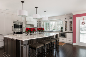 Like Barry's photo in April, Kate was faced with bright (very bright) windows, and dark, shadowy wood -- a real conundrum for a camera! Instead of just "nuking" the room with a single, powerful flash bounced from behind the camera, she used several "smaller" lights (I can see 3) to accomplish the job. As a result, the room has 3-dimensionality. Looking at the near corner of the island, you can see that the right facet is brighter, and the left facet is darker -- which is part of how the eye/brain interprets 3D objects. I need highlight and shadow to understand how things are shaped. Had this been lit with one overpowering light above or behind the camera, both the left and right sides of the island (and everything else in the room) would have been equally bright, which is counter-intuitive and oddly jarring to the viewer whose everyday experience is quite different!
A few notes: this seems to have been shot a little extra-wide. It's certainly nowhere near "UFWA", but there's really not much happening in the right-most 25% of the shot, and I definitely don't need that much ceiling! The camera's relatively low POV emphasizes ceiling and allows the island to occlude most of the kitchen itself. A higher POV would also help show off the graceful curve of the front edge of the island. That said, the color fidelity here is excellent (Kate made a good decision to turn off the lights), the distortion is minimal, and best of all, the shot doesn't appear to have been overcooked!
Ryan Wicks, February 2014: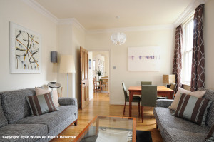 Here's a case study in "directional" light. This is exactly why, when you really want a beauty shot, you don't light from behind the camera! The first place to look is the table and chairs. You can't miss the highlights and shadows on those chairs! Every nuance of the shapes and textures is readily apparent to the camera. Ryan didn't need to do a thing to that part of the shot - he exposed for it (smartly avoiding the trap of under-exposing it) and then, presumably, lit the rest of the scene to match that. Every part of the shot, from the foreground to the distant sitting area (kitchen?) is lit from the right side. Ryan could, had he chosen to, placed a light camera left to brighten the sofa against the right wall -- but the result would have been awful - totally contradicting what I already know and expect about this room. Instead, it's the sofa on the left wall that's slightly brighter, as it should be.
I do think this would have been a stronger photo if the camera had been moved left and then lined up as a one-point perspective. That would have introduced some challenge since it would have opened up the view in the window; probably a more aggressive exposure would have been needed. But it would have been worth it, in my opinion.
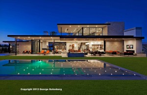
George Gutenberg, January 2014:
Having stunning subject matter never hurts! George knew he had a dramatic property, and he ran with that. While this photo clearly shows some "work" (the way some aging Hollywood actresses have "had work") the end result is still that of a striking architectural subject shown in every detail.
The long, low nature of the house is particularly challenging to compose well. You have to go wide (or get very far away) to fit the thing in horizontally, but you don't want an excessive amount of grass or sky at the top and bottom. Luckily, in this case there's a pool, and George might have been OK to move in and let the pool completely occupy the foreground, even if that meant breaking out a wider lens. There would be more "house" reflected in the water in that case, and even stronger leading lines created by the reflected pattern of the ceiling lights. The one-point perspective was absolutely the right way to go, here! I could make an argument for a lower camera POV, which would make the house a bit more imposing (and appear higher) while foreshortening the grass and pool, but it's really a matter of personal taste.
It goes without saying that George did a wonderful job of showing every bit of the interior, and quite skillfully. But it's the lines of the composition that draw me in most of all. I don't often get to say this, but I'm wishing for a slightly wider shot, here -- a house this grand shouldn't feel crowded. It needs a bit of elbow room! Imagine if I had the near right corner of the pool in the shot -- there would be a huge, exaggerated "Z" shape formed by the pool edging and the roofline that would ultimately force the eye to travel the full length and breadth of the shot. This is present as it is, but could be stronger.
Overall, well done!


Barry, congratulations! You've been showing us great examples of your work for a long time, and have been generously sharing! It's good to be king!
All of these photos are excellent. Great analysis as well. By the way, what's an UFWA lens?
I'm a big believer in praise tempered with constructive criticism. Scott clearly has that angled covered... Great work!
Well deserved Barry!! Congrats!!
Way to go, Barry! A well-deserved win ... not just for the MBR photo but for a *YEAR's* worth of great images just like it, all of which were distinctly yours and virtually all of them were stunners!! The highest caliber work, Barry! Congrats!
Very insightful analysis and critique Scott! I think all your comments were spot on. One of my take-homes from this exercise is to resist the strong urge to shoot UFWA in a lot of the cavernous luxury homes... as well as the smaller ones where the agents are expecting me to exaggerate spaciousness... or lack thereof. Thanks for the time and care you put into this. It's enlightening.
Congratulations to all! By the way, Barry and his technique were recently featured on an Fstoppers article, so kudos for that as well.
All of these images are so wonderful.
They are fine examples to real estate agents to show what a difference hi-quality photography makes in marketing a property.
so many agents hire the cheap "Point and Shoot" photographers, because they don't want to spend the extra money. What a disservice they do their clients.
On some of the images and the websites, I notice that the interior lights, lamps and chandeliers were not turned on. I normally have my agents turn on all the lighting while I am setting up my first shot. At what point do you decide weather or not to turn on the lights, which in many cases have caused me so much grief balancing exposures and whit balancing?
Some of the images on the websites, almost look like they are B&W, with some color enhanced. very impressive.
Congratulations to all, as these are truly beautiful examples of excellent photography
Eric, good question and a tough answer. It really depends on several factors when you think the lights should be on or off. I tend to expose as best as possible for the interior space, then adjust to compensate for highlights. I'll adjust further to the view outside and light fixtures. F8, slower shutter speed and about 200 iso. Speed lights bounced all over until I'm happy then powered up or done. If the light fixtures still look odd, I might gel to temp or turn the fixtures off and work out the best exposure from there. The short answer is it's up to what you think looks best. Some shooters prefer working with he lights off as it tends to work well. Others will work some more in post.
Congratulations, Barry! You've put out so much great work this year. Very well-deserved.
Congratulations to Barry! Well deserved, not least because he consistently produces really great work. In fact, all of the entrants are consistently excellent - there were no "one-hit" wonders in the field.
It's also encouraging to see that not all of these photos are of enormous mega-homes. Some of these are totally ordinary, mid-range properties, that were photographed with skill and insight. I would vote for a photo of a tarpaper shack if the photographer did a good job with it.
Congratulations Barry! Inspiring work. You had my vote. Also congratulations to all of the winners this year.
Thanks, everyone!! Scott, thanks for taking the time to review and critique all the finalist images - your input is invaluable!
All wonderful and congratulations to Barry! Thanks to Scott for the analysis and for the time it took to write it.
Great job, and congratulations Barry! You're body of work is inspirational!
@Scott- thank you for taking the time to do the write-ups of these images. It was great information about each image and helped me to 'understand' them a little more.
Congratulations Barry, it's a great image and had my vote in April. Well deserved!
Big thanks to Scott Hargis for the always insightful comments and observations.
Congrats Barry been following your work for a long time and all of your photos are always winners, well deserved.
Congratulations Barry and to all other recipients. All inspiring work!
Barry, always nice to have a local Canadian boy doing well in something they love and getting rewarded for all their hard work. Congrats.